
Get ready to have your mind blown.
Things aren't always what they seem at first glance, and these logos prove it. Check out these 13 famous logos that you may not have realized actually have a hidden double meaning.
1. FedEx
Things aren't always what they seem at first glance, and these logos prove it. Check out these 13 famous logos that you may not have realized actually have a hidden double meaning.
1. FedEx
Source: FedEx
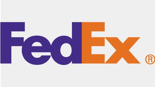
The shipping company's logo is probably one of the
best-known in the world of "hidden image" logos. For those who are
unaware, take a look between the "E" and the "X," where the negative
space forms an arrow. In an interview
with Fast Company, the logo's designer, Lindon Leader, said, "The arrow
could connote forward direction, speed and precision, and if it
remained hidden, there might be an element of surprise, that aha
moment." The design has won over 40 awards and was
ranked as one of the eight best logos in the last 35 years by Rolling Stone magazine.
2. Wendy's
ranked as one of the eight best logos in the last 35 years by Rolling Stone magazine.
2. Wendy's
Source: Wendy's
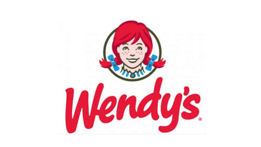
Famously founded by Dave Thomas, the Wendy's brand
identity highlights a personal and "home-cooked" feeling. Take a closer
look at Wendy's collar and you might just see the word "mom." Wendy's,
named after Thomas' daughter, now has more than 6,500 restaurants
worldwide. "This is something you may not notice consciously for years,
but unconsciously it will leave an imprint on your brain and you will
associate it with the brand," stocklogos.com wrote.
3. Baskin-Robbins
3. Baskin-Robbins
Source: Baskin Robbins
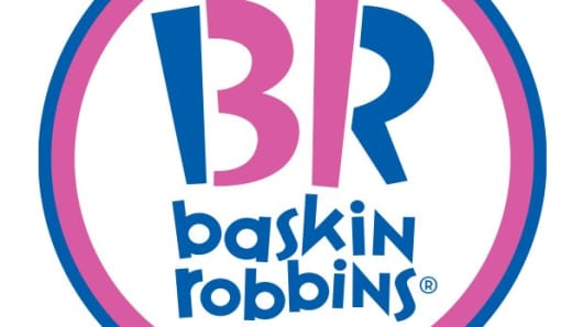
Baskin-Robbins, owned by Dunkin' Brands,
is the world's largest chain of ice cream specialty shops, best known
for its 31 flavors. The company's pink and blue logo depicts a large
"BR" that doubles as the number "31." Carol Austin, VP of marketing for
Baskin-Robbins, told CNBC that the logo is "meant to convey the fun and
energy of the Baskin-Robbins brand" as well as the iconic 31. "The 31
stands for our belief that our guests should have the opportunity to
explore a fun, new ice cream flavor every day of the month," Austin
explained. The logo was introduced in 2005 as part of an entire brand
refresh.
4. LG
4. LG
Source: LG
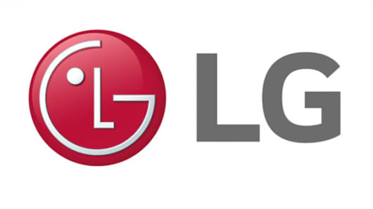
At first glance, the dark pink logo for LG Electronics
looks like a winking face. But if you look a little closer, you'll see
the face's "nose" is an "L" and the outline of the "face" is a "G." Some
fans have even noted a similarity between LG's logo and a modified
Pacman.
5. Tostitos
5. Tostitos
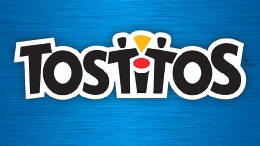
Source: Tostitos
The logo for tortilla chips and dips manufacturer Tostitos, owned by PepsiCo,
is a prime example of "once you've seen it, you can't un-see it."
Initially, the logo appears to be the Tostitos name in front of a
vibrantly colored background. However, the two "T's" of this logo make
up people, as they dip a tortilla chip into the bowl of salsa on top of
the letter 'I'.
6. Hershey's Kisses
6. Hershey's Kisses
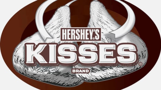
Source: Hershey
Famous for their chocolate and appropriately themed amusement park, Hersheypark, the logo on The Hershey Company's
Hershey's Kisses product has a hidden logo: an extra Kiss. Turn your
head to the left and you'll see that between the 'K' and the 'I' there
is a Hershey's Kiss baked into the logo.
7. Hope for African Children Initiative (HACI)
7. Hope for African Children Initiative (HACI)
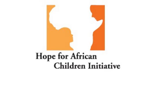
Source: Hope For African Children
Supporting African communities is the pillar of HACI's
mission and it's clearly reflected in the organization's vibrant logo.
The Hope for African Children Initiative's golden yellow and orange logo
uniquely utilizes negative space to create two images: the continent of
Africa and a child looking up at mother.
8. Toblerone
8. Toblerone

Source: Toblerone
Toblerone, owned by Mondelēz International
(formerly Kraft Foods), was started in Bern, Switzerland, a city
famously associated with bears. Now take a closer look at the logo's
mountain. If you start to get a craving and want a free taste test from
the company, you're out of luck. "Unfortunately we cannot send free
samples of chocolate by mail," the company's FAQ reads.
9. Pinterest
9. Pinterest
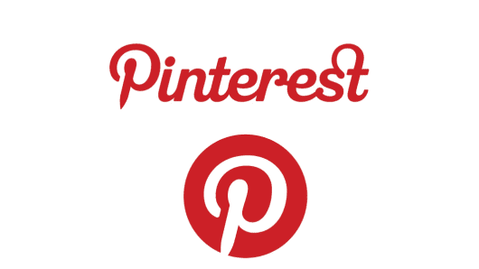
Source: Pinterest
The digital pin board site, Pinterest, tied its logo
directly into the social network's core. While the hidden image might
not be immediately obvious, it is certainly fitting for the platform:
the letter "P" doubles as a pin. Michael Deal, co-designer of the
Pinterest logo, said: "For most of the project, I had avoided making
visual reference to the image of a pin because it seemed too literal.
But the "P" started to lend itself too well to the shape of a map pin."
10. Goodwill Industries International
10. Goodwill Industries International
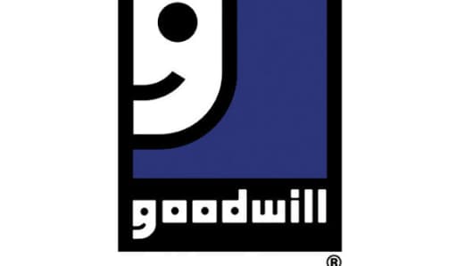
Source: Goodwill
This community-based organization prides itself on making
people's lives better, with the trademark to prove it. It's no surprise
that the not-for-profit's logo makes use of some simultaneously
functional and encouraging lettering: the lowercase "G" in "goodwill"
doubles as a smiling face and appears twice in the company's logo.
11. Formula One/F1
11. Formula One/F1
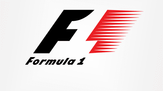
Source: Formula One
Formula One racing is another organization that took the
sport's core values and applied them to its logo. The red color
represents passion and energy, while the black color represents power
and determination, according to sportskeeda.com.
With another play on negative space, the F1 logo is more than a black
"F" with red racing stripes; the space between these two main focal
points is the number 1.
12. The Bronx Zoo
12. The Bronx Zoo
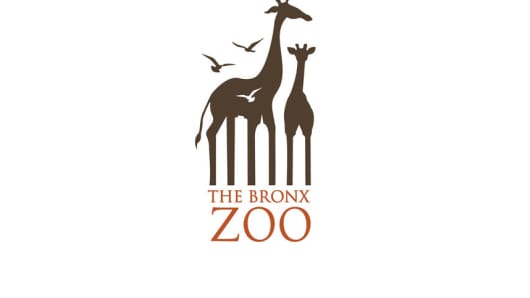
Source: The Bronx Zoo
The Bronx Zoo, located in the Bronx, a borough of New York
City, is the largest zoo in North America and is among the largest
metropolitan zoos in the world. The zoo's logo featuring birds and two
giraffes pays homage to the zoo's home city. Between the legs of the
giraffes, you'll see New York's iconic skyline.
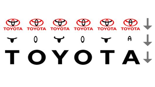
13. Toyota
13. Toyota
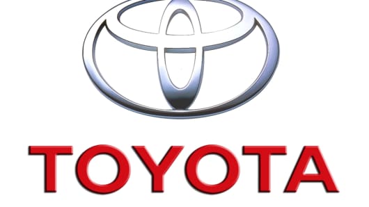
Source: Toyoto
This car manufacturer's logo certainly encompasses more
than meets the eye. Toyota said that the three overlapping ovals on
American vehicles "symbolize the unification of the hearts of our
customers and the heart of Toyota products. The background space
represents Toyota's technological advancement and the boundless
opportunities ahead." And possibly even more impressive, if you look
even closer at the overlapping ovals, you'll see the word "Toyota"
spelled out.
Source: Diply
gta 5 apk
ReplyDeleteCharlotte should be refusing Natalya’s help against Sasha Banks and looking to avenge her only defeat as champion, even if it was a non-title match.
Cricket fans can Watch Live Cricket Today for free including latest updates, live streaming, live score and much more about the mega cricket events on their smart device.
ReplyDelete